Waiting Room App
UX design for Royal Edinburgh Infirmary that enhances patient experience within the A&E department.
UX/UI Design
Overview
University project working with Edinburgh Royal Infirmary.
Client
NHS Edinburgh
Discovery
Our research focused on the patient experience throughout the A&E department. During our research we visited the different areas within the A&E department, observing patients, speaking with staff and understanding the main issues patients face.
-
Below is a mapped out diagram of our journey into the A&E department, one of the first issues were poor signage systems within the hospital, making it difficult navigating to the A&E Department.
Overview
At the discovery stage we gather as much information about the issues and the product. This allows us to better understand users needs

Within the A&E department we spoke with a number of patients with non-threatening symptoms in the waiting room area. Below are some of their key insights into what they felt were the main issues with the A&E Room

Patient in the waiting room area
“What’s frustrating is the waiting and the lack of information, I don’t know how long I will be here ”

Patient in the waiting room area
“Our waiting room had literally nothing in it”


-
Debra is a patient that arrived for Trauma help. She was advised to go A&E by her Physico. Within the A&E she was transported to minor injuries. A lot of her time within the A&E department was spent in waiting
-
Ben is 45 and came into the A&E department on a wheelchair. He sustained burn marks from a fight. He was involved in a domestic arguments, his wife poured hot water on him leaving him with burn marks
-
Lewis is one of the head consultants within the A&E department. He followed his journey through out his day and identified key moments were opportunity might arise for design intervention
Personas
After interviewing and surveying patients in the A&E department we created the following personas to better understand their needs and issues


Define
At this stage of the project we began our independent design directions. I chose to focus on the waiting room experience. Targeting Patients with non-threatening symptoms. Below is the first low fidelity concepts looking into how the waiting experience could be enhanced
-
The main insights within the waiting room area were lack of information for the patients, the constant staff interruption for basic patient enquires, lack of information regarding their wwaiting time and a&E Journey
Develop
I started to develop this idea further looking into how this experience could become more personal for the patient. I started to refer back to the user journey of patients and to identify when, where and how to intervene the experience
Below is the defined user journey for the waiter room app experience. The main aim of the app is to give freedom to the user by providing them with useful information throughout their A&E journey


Deliver
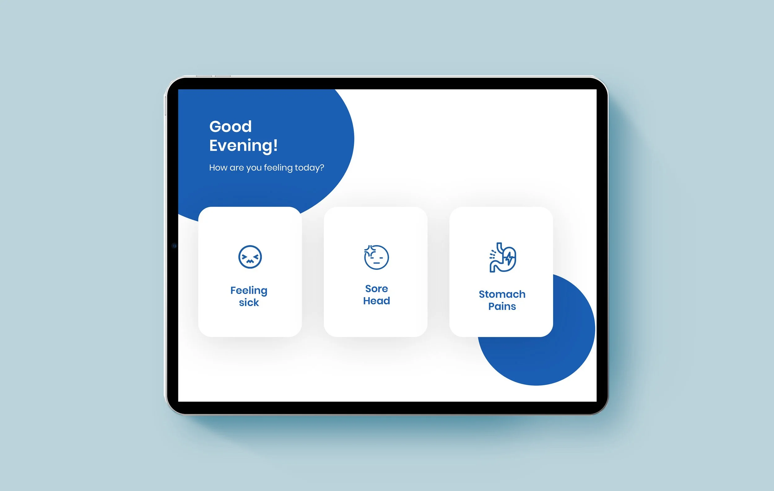
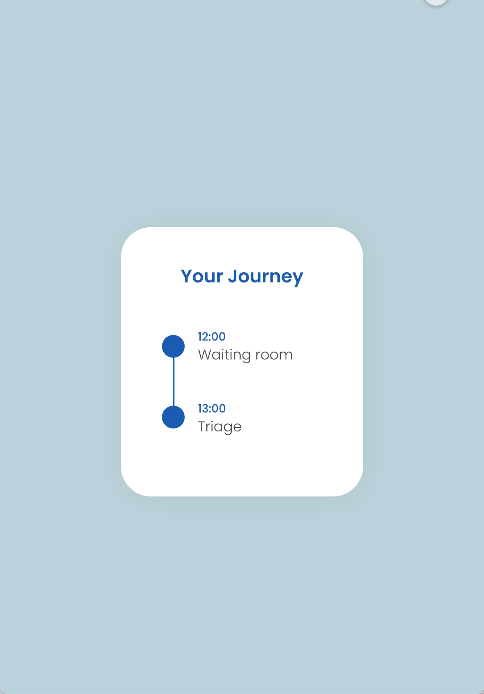
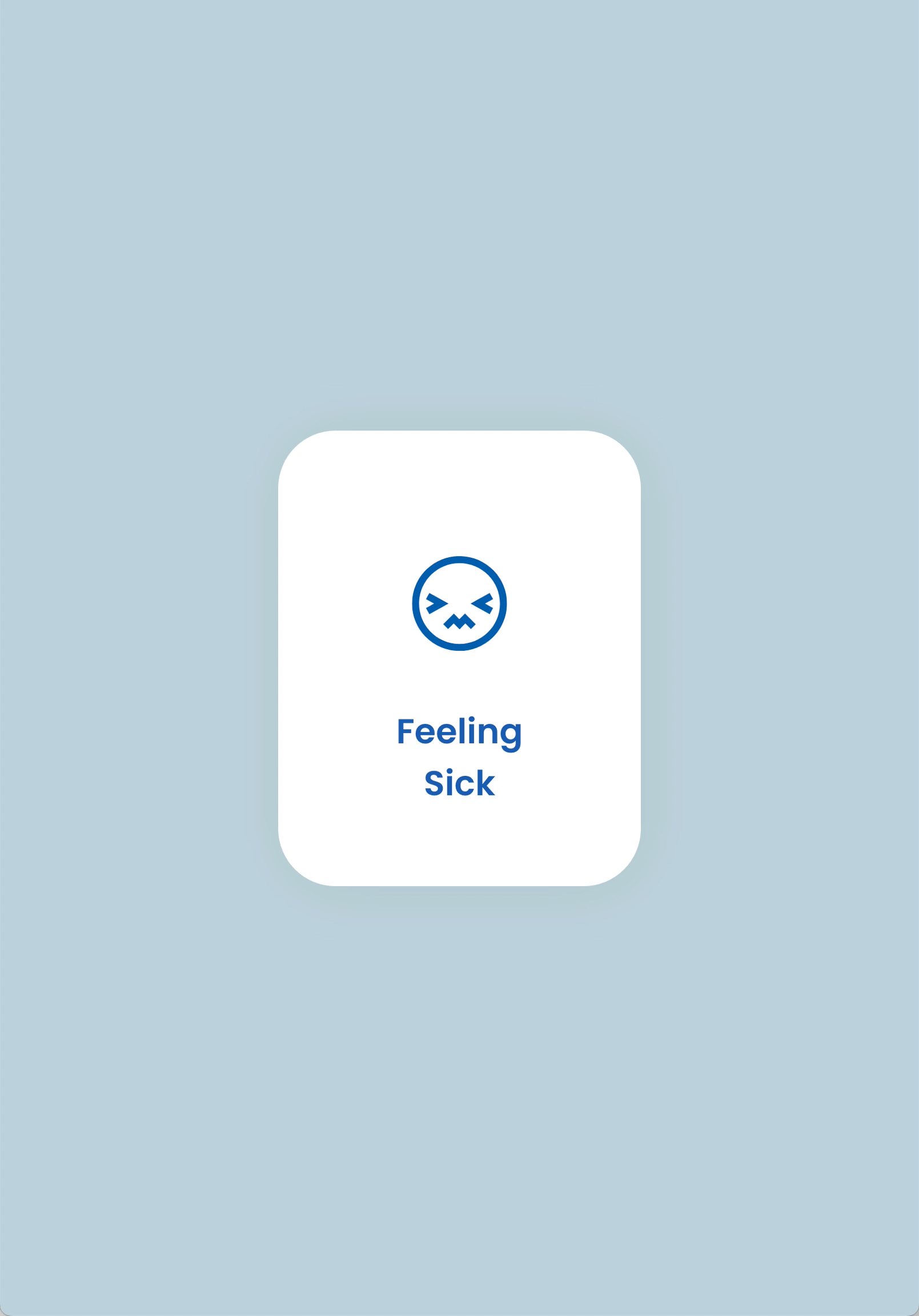
At this stage of the project I started to refine the idea further by creating High fidelity mockups for the app. These mockups also introduced refined colour pallet and enhanced UI
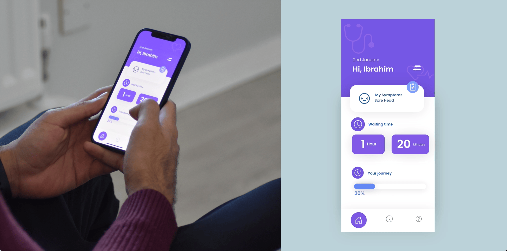
The Three main screens are defined by the main dashboard where users can get a quick glimpse of all the information relevant to them. Timeline screen where they can see their journey throughout the A&E department. Waiting time, where they can see exactly how long their waiting time is.
Press
Thanks for viewing, Check out my other projects also!
Think we can work together? Get in touch and lets discuss!